National Insurance Institute (INS)
The National Insurance Institute (INS) is a government-owned insurance company in Costa Rica and is the sole provider of insurance services in the country. INS offers a wide range of insurance products, including life insurance, health insurance, property and casualty insurance, and other types of coverage.
MY ROLE
Sole Product Designer
TEAM
Me and UX Researcher
TOOLS
Figma
Photoshop
Illustrator
Overview
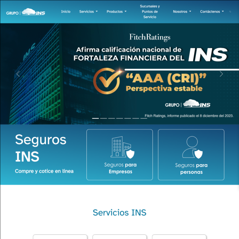
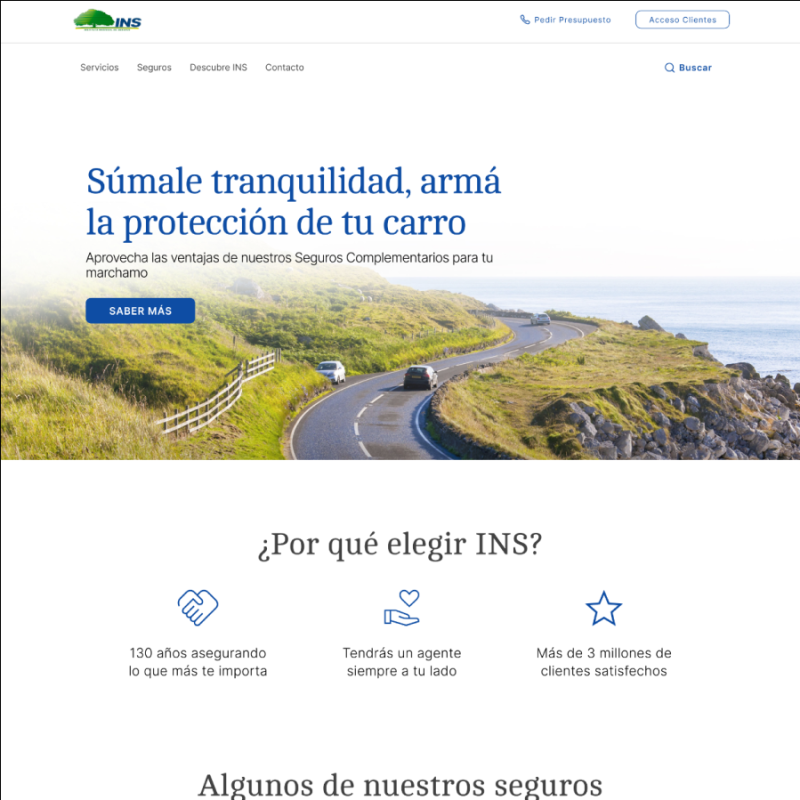
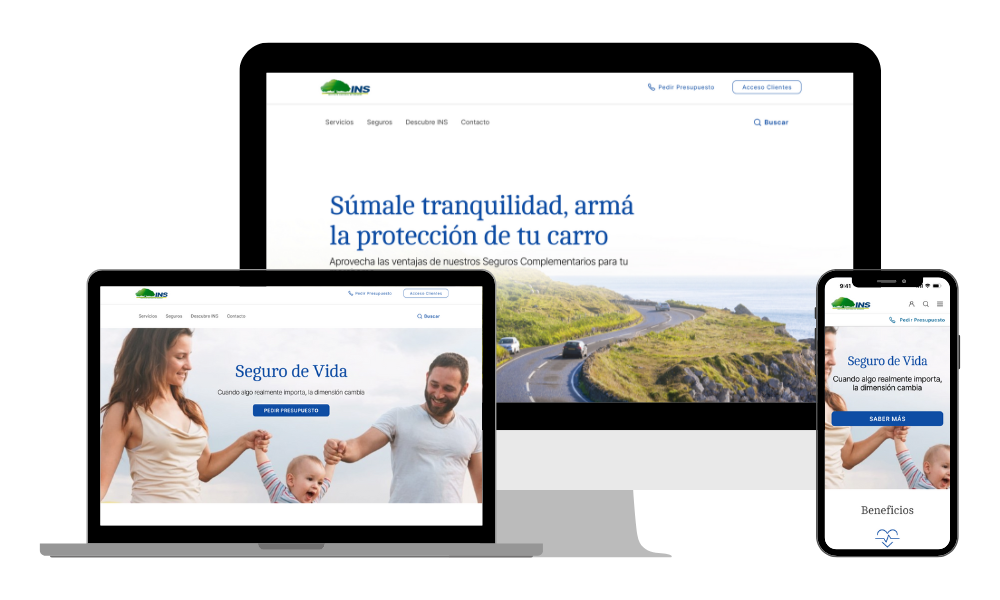
I initiated an unsolicited redesign project, where I focused on revamping the insurance flow and the homepage I had originally designed in 2020, making these designs responsive, and proposing a more organized information architecture. My strategy centered on selecting the ‘personal cover insurance’ user flow to work on, considering the complexity of the website and the timeframe available.
Problem
- Complex navigation and poor mobile responsiveness, causing user drop-offs.
- Users find it difficult to understand the insurance products offered
- There is no easy access to information, particularly on mobile devices.
These issues highlight urgent needs for interface simplification and mobile optimization.
Outcome
- Reduced cognitive overload on the home page.
- Reduced drop-off rates from 77% to 15%, ensuring more users complete their journey.
- Improved information discoverability, empowering users to find what they need easily.
Discovery phase
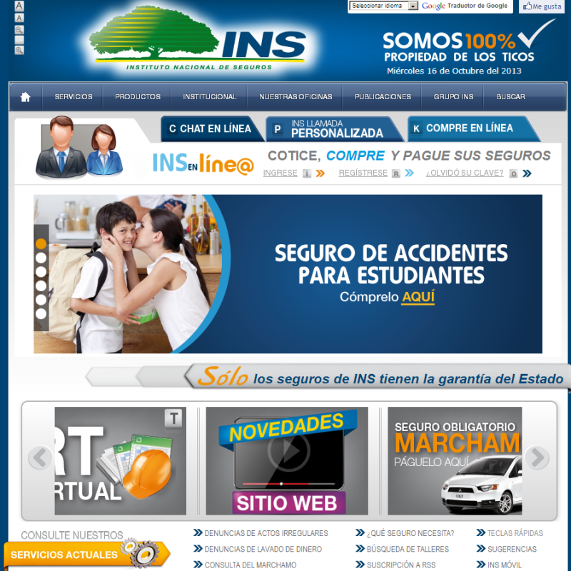
The INS website struggled with complex navigation and poor mobile responsiveness, causing user drop-offs. Users find it difficult to understand the insurance products offered and to access information easily, particularly on mobile devices. These issues highlight urgent needs for interface simplification and mobile optimization.
Key Insights
I quickly realized users’ drop-off points by collecting data, conducting research about INS’ user behavior, and studying other insurance companies. These insights helped me determine how to approach MVP solutions.
Most users drop off the INS website during the search process because of “complex navigation”. (77%)
- Users, especially those with less experience, struggle to find helpful information on the site. (25%)
- Half of INS users do not perceive the full range of insurance products clearly and straightforwardly. (50%)
- Almost all of the users tried to access the website via mobile, and it appeared not to be responsive. (92%)
Goal
• Ensure responsive design through the platform, starting with a mobile-first approach.
• Create a simple and intuitive navigation system for an easier, clearer way to access information and user support.
• Aim to increase user satisfaction and improve usability by at least 60%, based on insights from a heuristic analysis.
Information Architecture
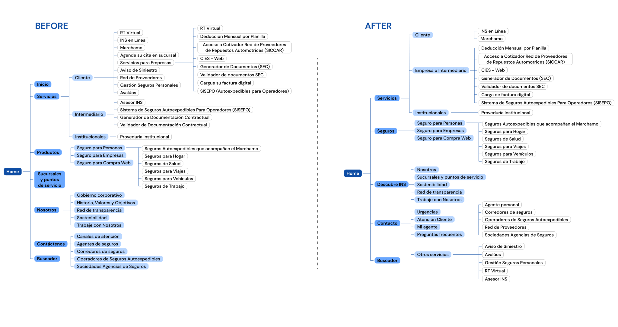
I began with a Heuristic Evaluation. With the insights, I began conducting one open card sort study with 20 labeled cards; then I conducted a closed card sort, asking 10 participants to organize labeled cards into a pre-assigned set of categories (to evaluate the existing site structure).
Insights:
Given that participants have organized the cards based on their function or location, I decided to:
- Rename the content labels
- Restructure the site’s information architecture
- Streamline the navigation sections to make information more easily findable.
Design solutions
To ensure that I’d achieve my goals by the end of my design process, I came up with several interactions that corresponded with each one.
1. Streamlined search experience
Creating a streamlined search experience was key in improving user retention.
My design aimed to provide a clear and easy search experience for the user.
2. Enhance product information
Building upon user feedback, I enhanced the product information. The goal is to offer a robust, efficient and clear product section, ensuring users can quickly find relevant information with minimal effort.
Clear and intuitive menus and labels were implemented to guide users efficiently.
3. Responsive design with a friendly and user-oriented language
Lastly, I created a simple yet consistent design language that can easily adapt to mobile, web, and other screens as INS platform grows.
Usability Testing
I ran and planned the script for a remote and ‘think out loud’ usability test. I conducted five sessions to go through two main tasks based on two user journeys:
1. Search for information about Life Insurance.
2. Fill out a form and request an insurance quote.
Most users preferred to do the paperwork online rather than by phone. (85%)
- The error rate for form submissions decreased by 40% compared to the previous design.
- Users reported a much clearer perception of the insurance product range in the redesigned interface
Outcome
- Reduced cognitive overload on the home page
- Reduced drop-off rates from 77% to 15%, ensuring more users completed their journey.
- Improved information discoverability, empowering users to find what they need easily.
Next steps
- Expand user research by diversifying user demographics to understand different needs.
- Implement A/B testing to test new functionalities and evaluate their effectiveness and user reception.
- Improve features to make the app more accessible to all users.
- Ensure a seamless experience across different devices.
Previous Project
Optimy: Creating a Global Design System
Next Project
Toro Rosa: e-commerce design

