Design System
for Optimy
Optimy is a SaaS company that offers a management platform. This platform allows users to efficiently oversee and coordinate their grant, volunteer, donation, and sponsorship programs, fostering stronger relationships with stakeholders.
MY ROLE
UX/UI Design, Design System Documentation, Accessibility Design
TEAM
UX/UI Designer, UX Specialist, Front-End Developers, Product Manager
TOOLS
Figma
Notion
Overview
This project involved the implementation of a design system within Optimy’s SaaS platform, resulting in a significant enhancement of cross-departmental cooperation and a marked reduction in redundant meetings, thereby boosting overall operational efficiency.
Outcome:
- Streamlined collaboration by eliminating redundant meetings across various departments.
- Achieved significant efficiencies in the design process, reducing both the time and resources required for component synchronization.
- Enhanced overall design agility, expediting the development of new tasks through a more rapid, from-the-ground-up creation process.
Context
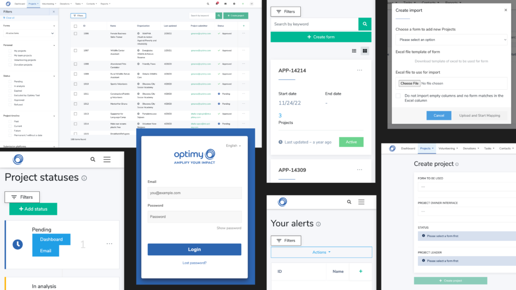
There wasn’t a design system in place, and we relied on constant meetings, team syncs, and group decisions in order to maintain a cohesive UI and consistent UX patterns. While this is manageable with a small team and a relatively simple product, we quickly realized that this wouldn’t be sustainable as more parts of the Optimy ecosystem were being constantly integrated into the platform.
Before creating the design system
Goal
Establish a clear and cohesive design system within Optimy’s Saas platform, connecting global teams through a common design language foundation. Ensure that this system remains easily understandable for any designer or developer involved in its execution.
Research
We took inspiration from several organizations that followed Brad Frost’s atomic approach to building a design system because it only makes sense to create a system where even the smallest parts of the component (atoms) are generalized.
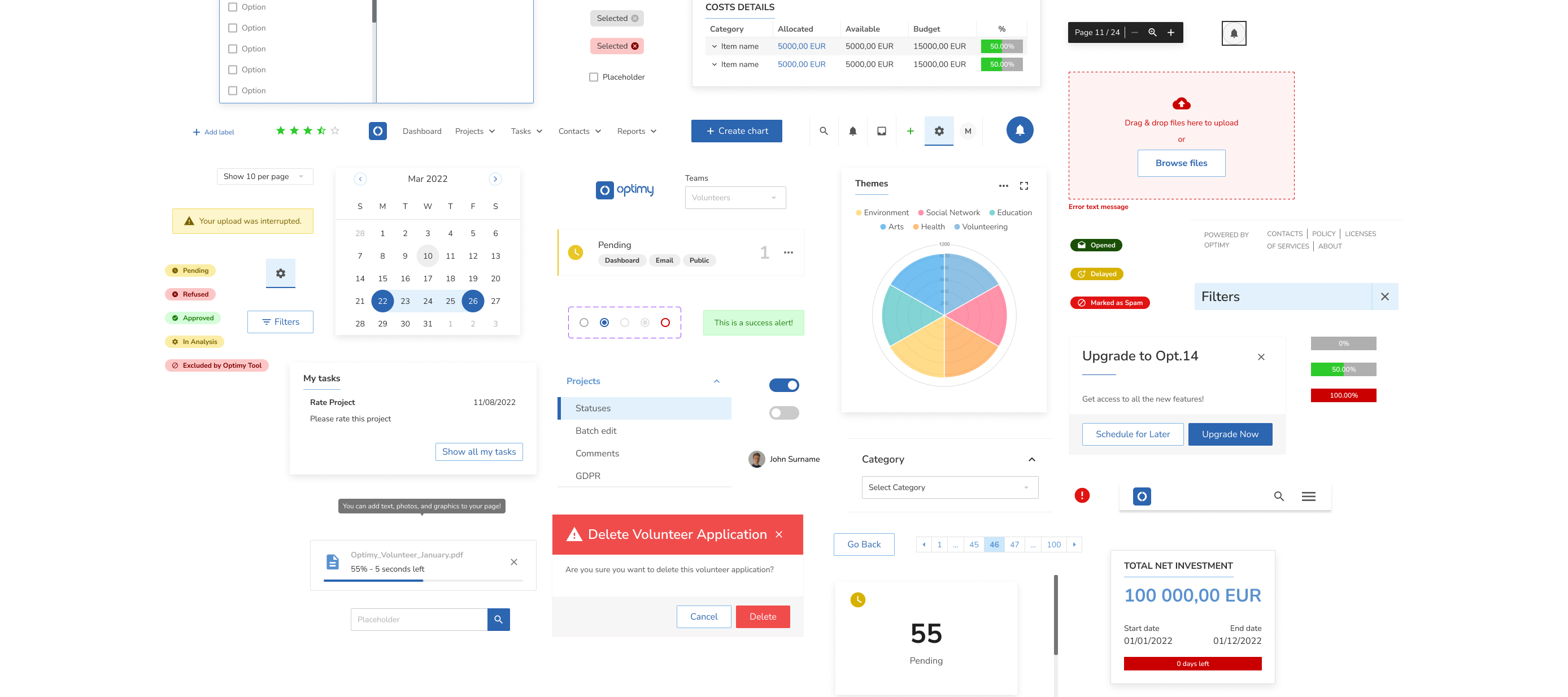
I took the lead to map with that approach and audited all the current UI components and categorized them to: Atoms, Molecules, Organisms or Templates.
Auditing the existing design

Challenges
Limited Resources: Our challenges were compounded by the absence of a comprehensive branding guideline and the unavailability of previous documentation and Figma files from prior designs
Communication and Collaboration: With only two UX designers, maintaining effective communication and collaboration became crucial for us to ensure a shared understanding of design principles and guidelines.
Documentation Burden: As a small team, the task of thorough documentation to ensure the design system’s clarity and usability became more demanding, diverting time and effort from design and implementation tasks.
Building the system
I defined a generic structure upon which we would build the system, essentially breaking down all elements into their most atomic form. Most importantly, the most common elements, like typography styles, colors, inputs, and buttons, would be detached from any specific context.
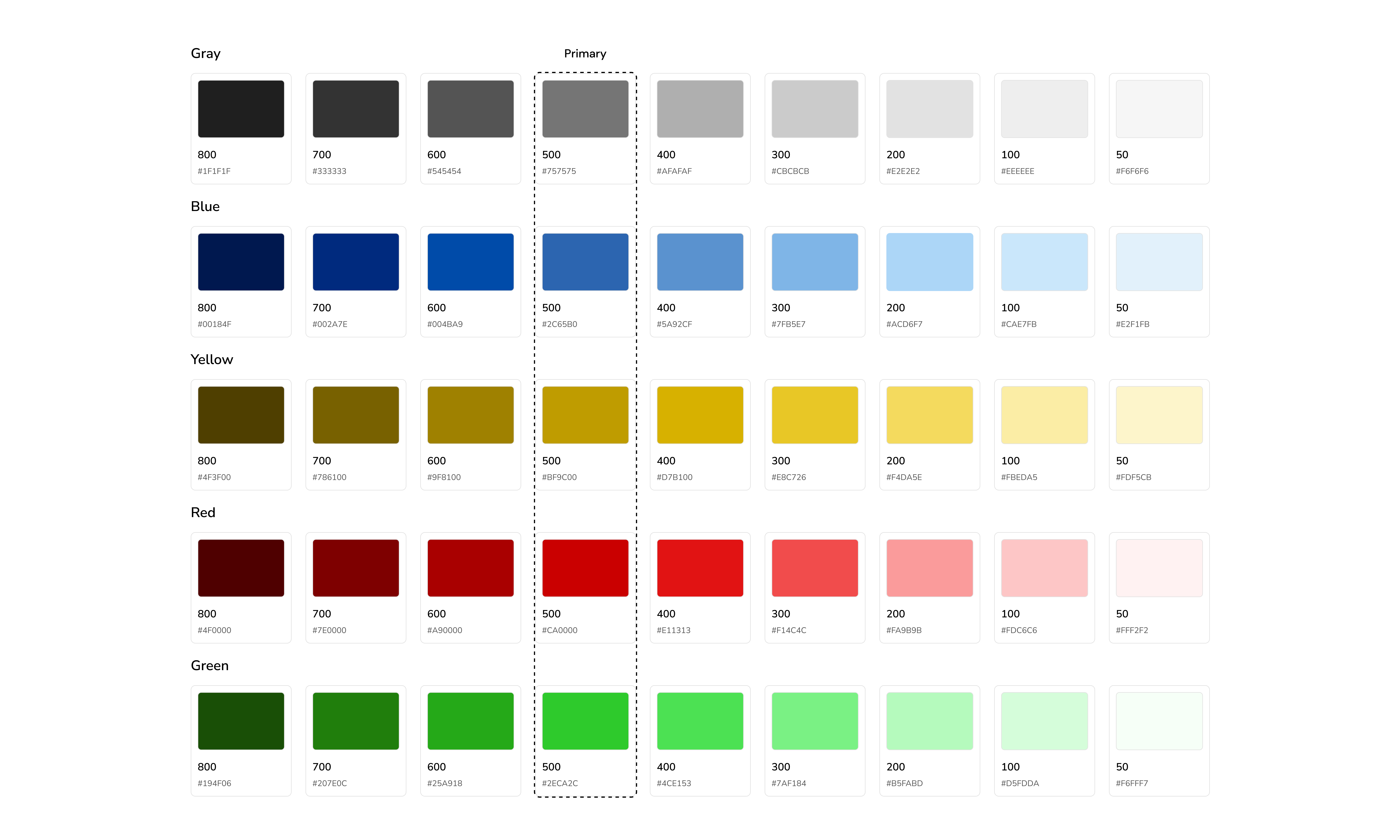
No branding guidelines were given, so in collaboration with the junior UX designer, we created a branding book with guidelines including a color palette, typography, and guidelines for specific situations when applied. The branding guidelines served as a foundation for building the design system.


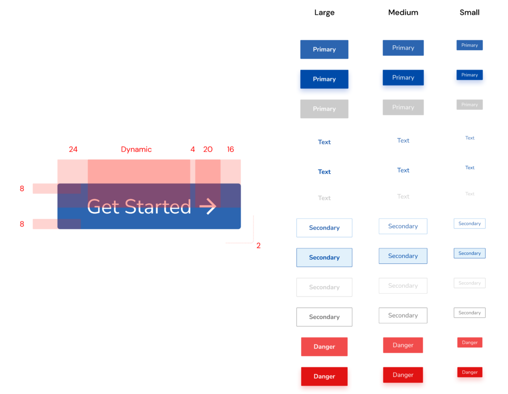
After defining a baseline scheme for colors, font, and space, we went on to the most fundamental elements, such as buttons, inputs, and forms, as they would serve as the building blocks for more complicated components and processes.
Because of the basic guidelines that we previously established, creating new components became a breeze. Every new component introduced has its own set of principles, specifications, and behaviors based on the prior components it was built from.

Documentation
As a complete workplace solution, we documented the guidelines and specifications in a Notion workspace for better collaboration directly with our design team and other stakeholders (development and marketing). We made sure to incorporate our design principles, guidelines, accessibility standards, and best practices for creating and testing the following designs.
Outcome
- Streamlined collaboration by eliminating redundant meetings across various departments.
- Achieved significant efficiencies in the design process, reducing both the time and resources required for component synchronization.
- Enhanced overall design agility, expediting the development of new tasks through a more rapid, from-the-ground-up creation process.
Learnings
Next time I’d approach a project like this, I would get buy-in from higher management and the development team to:
- Ensure our design system is fully integrated into code, which is key for its effectiveness and evolution.
- Collaborate with someone on the other team who is as invested as I am.
Securing this support is crucial for the design system’s enduring success because we’d have a clear strategic direction and the necessary resources. Collaboration with developers would ensure the system’s technical viability, keeping it effective and relevant over time.
Previous Project
Toro Rosa: e-commerce design
Next Project
INS: Redesign of the insurance section
